My book
My book, Designing Data-Intensive Applications, has received thousands of five-star reviews.
Published by Martin Kleppmann on 13 Nov 2007.
Here it is – my photo series documenting the menu madness of German ticket machines. See part 1 of the story for an introduction. This post contains a lot of graphics, so I’ve split it out into a separate page. Please click the title or the following link to read it.
These photos were taken in Stuttgart main station in July 2007. The ticket machine I am examining here is a modern touch-screen type – in some smaller stations there are also old style ticket machines which work completely differently, have far fewer features and are much easier to use. As far as I know, the old ones are being phased out.
A brief note for any Americans reading this – a “return ticket” is British for “round trip”, and “single” equals “one-way”.
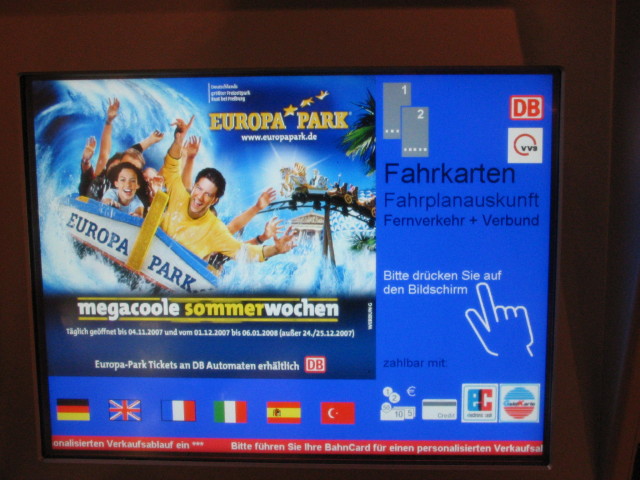
Screen 1: We are welcomed with advertising for a theme park. As far as I can see, the only useful feature on this page is the language selection – something which could easily be accomodated on the next page. One click wasted already, before we’ve even started.
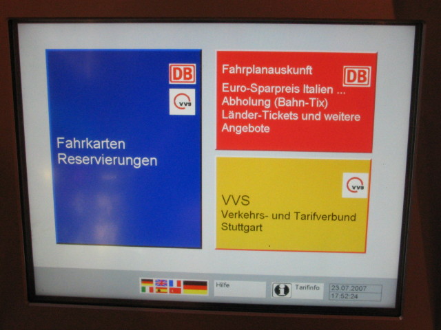
Screen 2: You’d think that not much could go wrong with just 3 buttons (plus a language selector, a help button and an information button at the bottom). Most people will just want a standard ticket, in which case the blue button (tickets + reserved seats) will do the job nicely. The red button seems to handle timetable lookups as well as special tickets (why are these not two separate buttons, as they are very differnt tasks?), and the yellow one is for local tickets within the Stuttgart area. Strangely, the logo for Stuttgart’s local transport system (VVS) appears both on the blue button (which is actually for long-distance trains) and the yellow button (local trains, S-Bahn, etc). If you have been given a place name and don’t know whether it’s local or long-distance… you’re stuck.
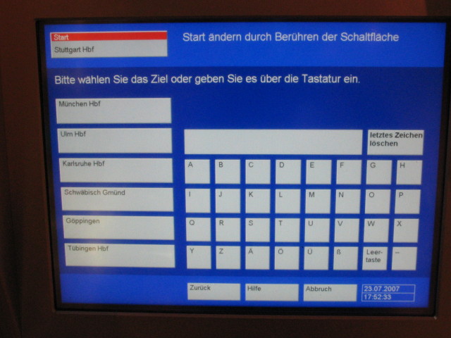
Screen 3: I clicked the blue button for long-distance trains. It shows me that the machine is assuming that I want to depart from Stuttgart (a sensible assumption given that I’m there), but if I wanted a ticket with departure from elsewhere, I could change it by pressing the button highlighted in red. I like that, and I’ve actually used the feature before when planning multi-stop journeys. The selector for destinations is also pretty clear – six common destinations to choose one, a keyboard for others. I’d prefer a QWERTZ layout, but this one is ok too.
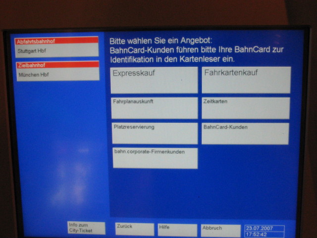
Screen 4: I chose Munich as destination. This is where it gets sticky. I now have 7 options: fast purchase, ticket purchase, timetable enquiries, season tickets, seat reservation, BahnCard customers, corporate customers. I have only ever tried out the first three. On the next few pages I will show what happens if you select the fast purchase route. But oh you poor soul if you don’t realise that both ticket purchase and fast purchase allow you to purchase a ticket, with the “fast” one simply asking fewer pointless questions.
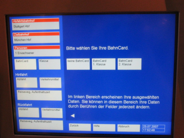
Screen 5: If I had chosen the slow track, the next question would have been how many adults and how many children are travelling. In the fast track, which I selected here, the machine assumes you are buying for just one adult. If you want to change it, you can still do that by pressing the bottom one of the three boxes highlighted in red.
The next piece of information it requires is whether you have a BahnCard (discount card for frequent travellers), and if so, what type. The weird thing about this screen is: buttons which you can optionally press (such as the number of travellers) are highlighted in red, but the buttons which you are required to press (the BahnCard selection) are not highlighted at all. And all the non-highlighted buttons in the left hand column actually have no effect. I have repeatedly seen people trying to press deactivated or red buttons, and missing those in the dark blue area, which are actually important for making progress to the next screen.
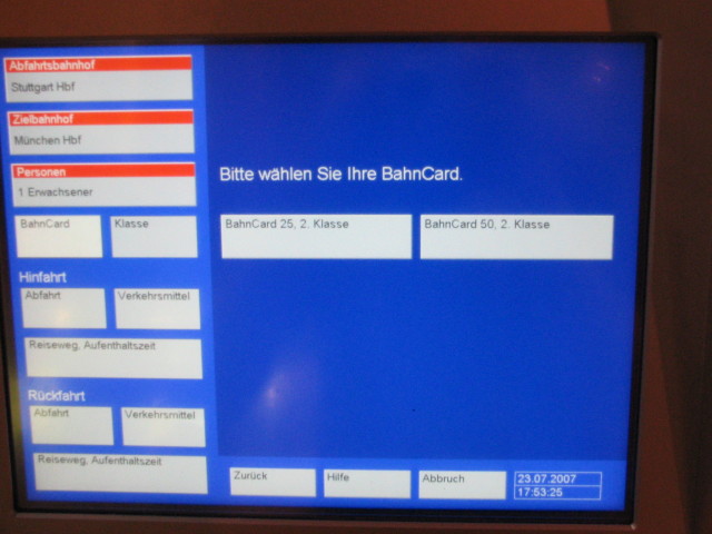
Screen 6: I selected that I have a second-class BahnCard, but that is not enough: the machine needs to know whether it is a type of card which gives a 25% reduction, or one which gives a 50% reduction.
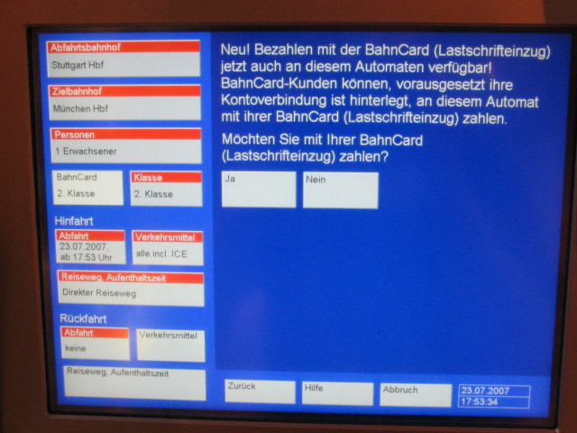
Screen 7: The next screen contains a really annoying question: do you want to pay by direct debit? Hell, I don’t even know yet how much the ticket is going to cost! And it only works if you’ve previously registered your BahnCard for direct debit anyway. I say no, leave me alone, you marketing people.
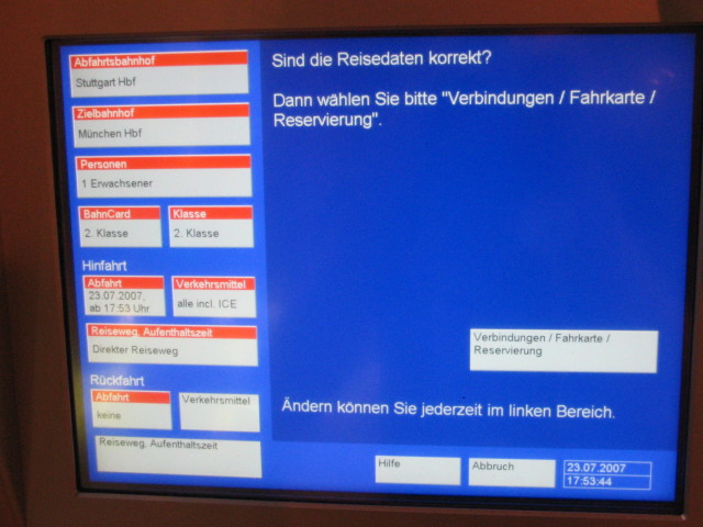
Screen 8: Notice that in the meantime a lot more boxes in the left-hand column have silently been filled with assumptions. It is assuming that I want to travel now (rather than some later date), using all trains including ICE (the fast trains, more expensive), by direct route. It is also assuming that I want a single ticket, i.e. no return. These assumptions are not too bad – yes, you’d expect that most people who travel somewhere want to come back again, so maybe a return would be a sensible default. But for standard tickets in Germany, a return is actually no cheaper than two singles, so it makes sense this way.
If you were to select a return journey, you’d have to choose the date and time for your return. Skip to screen 14 to see what this looks like.
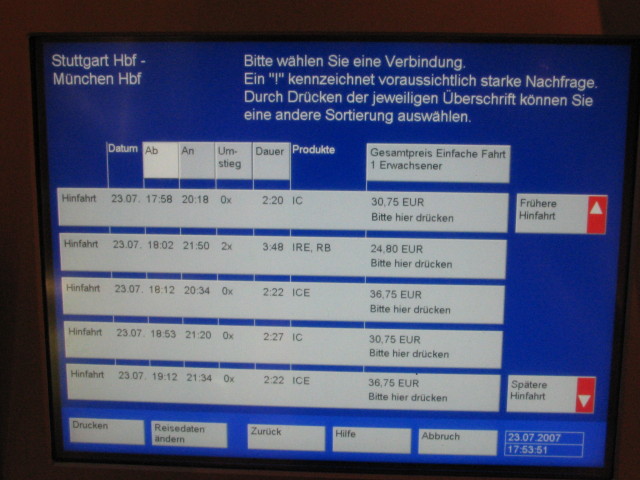
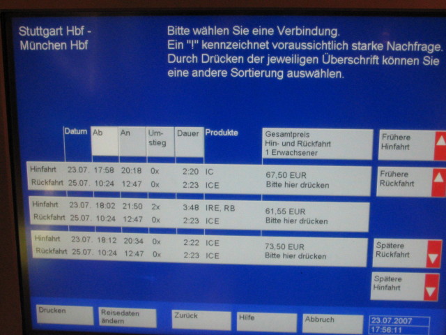
Screen 9: Did you find the button on the last screen which you need to press in order to confirm? It’s in the bottom right-hand corner of the dark blue panel, and it’s not highlighted in any way. I pressed it, and this is what you get: timetable information! Note how the price varies depending on the route, the time, the type of train, … man, I just want to get to Munich, no matter how!
You actually have to keep your eyes open here – the ICE train, usually faster than the IC, is more expensive by 6 € but actually takes two minutes longer. Quirky. Anyway, I choose the first connection. Would you have noticed that the grey box containing the information about one particular connection is simultaneously the button you need to press to select it? (The text “Bitte hier drücken”, i.e. “Please press here”, gives it away. Very easy to miss though.)
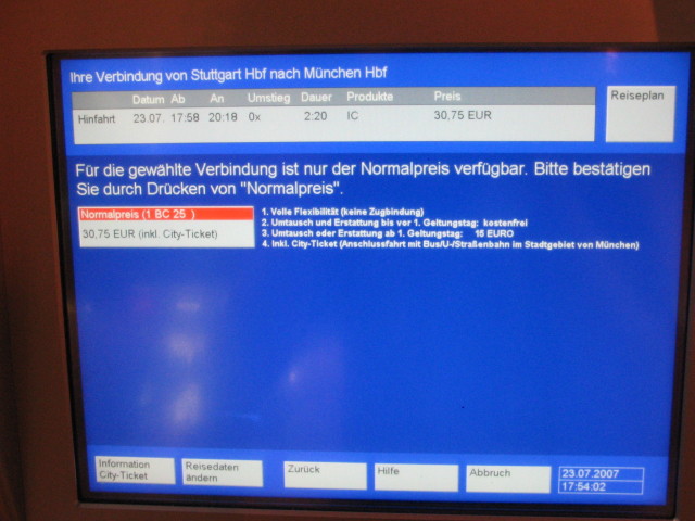
Screen 10: It asks me to confirm the ticket type and conditions – that’s ok. Except that the red highlight is now on the “confirm” button – on previous screens, red had been a marker for optional buttons.
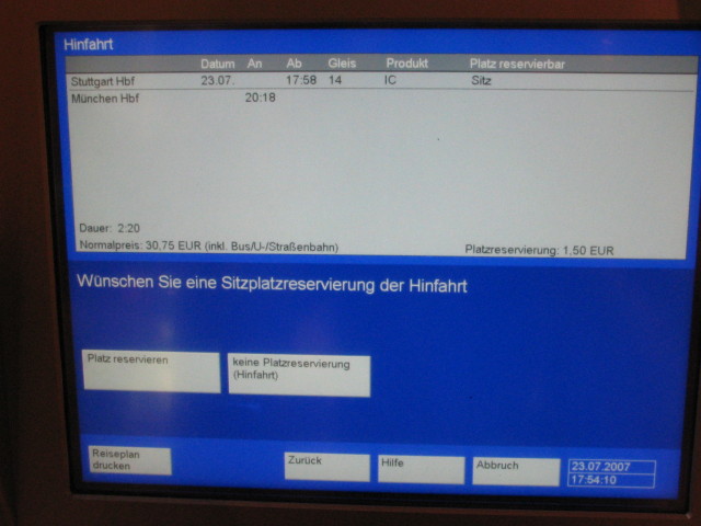
Screen 11: I have the option of reserving a seat, for an additional 1.50 €. I am already thoroughly fed up with the machine, so I decline the offer (knowing that if I accepted it, I would have to tell the machine whether I want a window or aisle seat, compartment or saloon coach seat, smoking or non-smoking, … too many choices!).
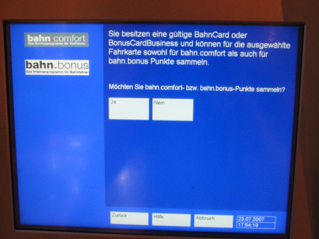
Screen 12: Do I want to collect points on my loyalty card? Argh, go away, give me the ticket!
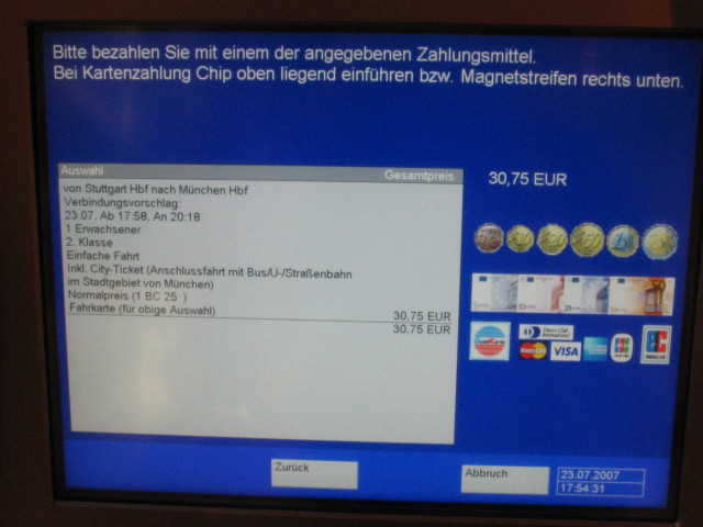
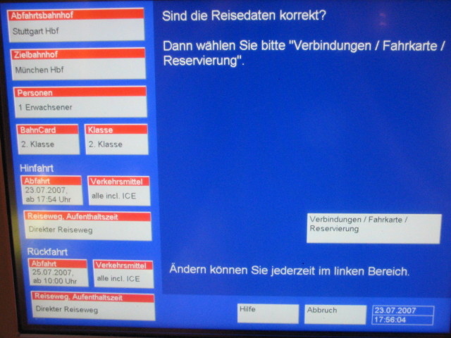
Screen 13: Hurrah, payment stage at last. Note this number of screens is the minimum you can possibly get away with in order to buy a single ticket. If you don’t choose the fast track or you get lost in the convoluted menu system at any stage, you can easily expect to spend a lot longer in front of the machine…
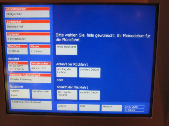
Screen 14: Here are a few more screens illustrating what happens if you choose to buy a return ticket. You also get similar screens even for a single ticket if you don’t choose the fast track. This screen gives you the following choices:
Now what on earth is this about? Sleeper trains are not very common, so usually the departure and arrival dates will be the same. The intellectual effort of figuring out which button to press is actually quite significant. And what if you have 3 minutes to go before your train departs?
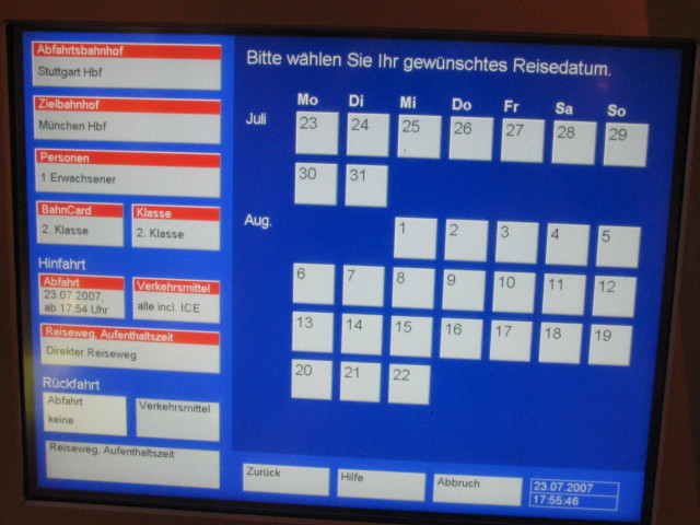
Screen 15: Ok, so I chose that I want the return on a different day, not today. I get a calendar – that’s easy enough.
Screen 16: Having chosen a date (the box Abfahrt (departure) under Rückfahrt (return journey) in the left-hand column has been updated), I am asked for the time. This is important because, as you recall, every different route may have a different price…
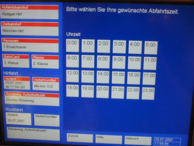
Screen 17: I selected 10:00 as time of departure. Now we’re back on the confirmation screen (similar to screen 8).
Screen 18: This is the equivalent of screen 9 if you have selected a return ticket. You need to choose route, type of train and time for both the outbound and inbound portions. These are two independent choices – you could, for example, go out on a slow train and return on a fast one (as the middle one of the three connections on this screen demonstrates). And somehow, in a most freaky way, the designers of this interface have mashed two independent choices into a single one. By pressing one of those buttons you choose both portions of the journey simultaneously.
The scrolling arrows on the right are labelled “earlier outward journey”, “earlier return journey”, “later return journey” and “later outward journey”. Presumably these will shift the selection of outward connections relative to the selection of return connections (or vice versa), thus allowing arbitrary combinations to be made. But frankly, I couldn’t figure it out and didn’t have the time. If you had a maths degree and half an hour to spare, you could probably understand what it does. How the average Joe Bloggs is supposed to manage in a hurry, I have no idea.
Confirming one of these tickets will go back to the screens shown previously, from screen 9 onwards. Only four more screens until you can finally pay, folks!
In summary: the key problem with these ticket machines is the fact that they roll timetable enquiries and ticket purchase into one, due to the fact that route affects price. In order to simplify the interface, you’d really have to simplify the pricing structure first. But even with the current tariff structure, giving clearer visual cues would already make a world of difference to a first-time user.
Another problem is when marketing drivel gets in the way, such as the theme park screen and the direct debit screen.
If you found this post useful, please support me on Patreon so that I can write more like it!
To get notified when I write something new, follow me on Bluesky or Mastodon, or enter your email address:
I won't give your address to anyone else, won't send you any spam, and you can unsubscribe at any time.
My book, Designing Data-Intensive Applications, has received thousands of five-star reviews.
![]() Unless otherwise specified, all content on this site is licensed under a
Creative Commons
Attribution 3.0 Unported License.
Theme borrowed from
Carrington,
ported to Jekyll by Martin Kleppmann.
Unless otherwise specified, all content on this site is licensed under a
Creative Commons
Attribution 3.0 Unported License.
Theme borrowed from
Carrington,
ported to Jekyll by Martin Kleppmann.