My book
My book, Designing Data-Intensive Applications, has received thousands of five-star reviews.
Published by Martin Kleppmann on 19 Jul 2007.
Welcome to Yes/No/Cancel, the online usability magazine. This first article describes the origin of the name, and explains why it is bad to use buttons labelled Yes, No and Cancel in computer programs. I also discuss why user-friendliness in general is a very important topic.
This online magazine (or blog if you will) is about user-friendliness, and lack thereof. It criticises bad design and promotes good design. One might think that after usability research has been conducted for many years and many books have been written on the topic, finally people would have learnt to get it right. But no – my impression is that many products are as bad as ever, and the reason why I am writing this is to raise awareness of these problems.
But why should you care? As a user, you should care because you have a choice – you can stop using/buying the product that is not friendly to use. You can switch to a better one, saving you frustration and annoyance. As a manufacturer, you should care for much the same reason – you are in a competitive environment, and if you don’t carefully consider the needs of your customers, you will see them leaving very soon!
Maybe you ask how this website got its name. Yes/No/Cancel, that sounds like computers. Yes, and a lot of the content here (but definitely not all) is going to be about computer software. Today, many pieces of software are amongst the most complex pieces of engineering which the human mind has devised. It is therefore not too surprising that some software packages are extremely difficult to use. But software is also used by many people every day who don’t want to know about this complexity. Is difficulty of use really necessary? There are some examples of extremely complex systems which are absolutely straightforward to interact with (Google search for example – it’s the work of a big team of the world’s best software engineers over several years, and still it’s just a simple search box).
Making complicated systems easy to use is actually quite a difficult problem. Part of the problem is that the engineers designing the system are often used to a certain way of doing things, but this way is not always best adapted to a particular situation or audience. The designers and developers of a system must therefore constantly be questioning their habits, so that they can find better ways of solving problems if better ways exist.
One particular bad habit of programmers annoys me so much that I decided to name this website after it. Johannes suggested the name: Yes/No/Cancel. The choice you are so often presented with in many computer applications, and so often you have to stop and think, because it’s not immediately clear what each of the choices is actually going to do. Which one of the buttons will cause all your work to be lost if you press it? Which one will save it? And what does Cancel mean anyway? Aaargh, it causes headaches.
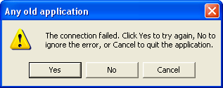
Let me explain this with a few examples. A situation in which you frequently encounter a Yes/No/Cancel dialog box is when you are trying to close a document without having saved it. Like this:
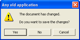
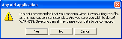
Nice of it to ask, you say – you had completely forgotten to save. Ok. Now compare it to this one:
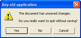
Can you believe it? It’s asking the opposite question! Now even if you usually know by habit which button to press, suddenly you have to stop and think. And this box is even worse, because it’s not clear what the difference is between No and Cancel.
Fundamentally the problem here is that we are actually asking two questions at the same time:
The answer to each question might be yes or no, which gives us four different possible actions:
The fourth option is generally perceived to be silly, so there is no button for that purpose and we get a choice of three. In the first example picture, these three correspond to Yes, No and Cancel respectively. What about the second example? Clicking Yes will “discard changes and quit”. Maybe clicking No will save changes and quit, or maybe it will do nothing. Who knows what cancel will do, let alone the mystery of the red X in the corner.
Already with simple examples like this, you can begin to see that it’s a bad idea to label buttons as Yes, No and Cancel. The meaning of these words depends very much on the question. In fact, if you have no previous computing experience, you will probably have no idea what to answer. As a user, you just want to know which button is going to cause your work of the last 2 hours to be lost – and neither of these examples makes it immediately clear which the “dangerous” button is.
Apple have tried to avoid this problem by not labelling the buttons Yes/No/Cancel, but more descriptively:
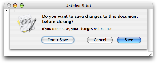
Using a verb (in this case “save”) is recommended in Apple’s Human Interface Guidelines. Also note that the “dangerous” button (which discards changes and quits) is set apart from the two “safe” buttons. This is clearly much better already, but the program is still trying to answer two questions at the same time, which you may consider to be an unnecessary complication.</p>
I won’t dwell on any Microsoft vs. Apple discussion though, because what I am saying applies not just to these two companies, but also to every other organisation or person who writes software. And there are some terrible occurrences of Yes/No/Cancel in the world for which neither Microsoft nor Apple carries any blame.
One terrible thing which you see sometimes is an implicit relabelling of the buttons. Here the programmer clearly couldn’t be bothered to make his own buttons, and instead placed the burden on the user:
You really need to switch on your brain to decide which button to press. And by phrasing the question badly, it can get even worse:
At this point, I very much hope that you will have run out of the room screaming. And maybe returned to read the rest of this article. (With a headache.)
You might think that the last example was very contrived, but the point I wanted to make was about negative questions. Why ask whether not to do something (the negative) if you can simply ask whether to do something (the positive)? I find this occurring particularly frequently with respect to checkboxes:

It is counterintuitive to put a tick in a box for something you don’t want. Just don’t ask negative questions. But that’s a story for another day.
A few final remarks:
If you found this post useful, please support me on Patreon so that I can write more like it!
To get notified when I write something new, follow me on Bluesky or Mastodon, or enter your email address:
I won't give your address to anyone else, won't send you any spam, and you can unsubscribe at any time.
My book, Designing Data-Intensive Applications, has received thousands of five-star reviews.
![]() Unless otherwise specified, all content on this site is licensed under a
Creative Commons
Attribution 3.0 Unported License.
Theme borrowed from
Carrington,
ported to Jekyll by Martin Kleppmann.
Unless otherwise specified, all content on this site is licensed under a
Creative Commons
Attribution 3.0 Unported License.
Theme borrowed from
Carrington,
ported to Jekyll by Martin Kleppmann.