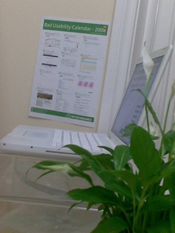
Bad usability calendar
Published by Martin Kleppmann on 28 Jan 2008.

Netlife Research, a usability consultancy from Norway, has come up with a
neat humorous way of pointing out some design elements which can help improve usability (or rather,
design errors which can render a product pointless for most of its potential users). They have put
these handy hints together in the form of a calendar – the
Bad Usability Calendar. You can download it and print out a copy for
yourself. Such as I have done, see the photo (which includes a gratuitous reference to
potted plants). Thanks to
Johannes for pointing it out to me.
Amusing though the exercise is, it
proves once again how hard it can be to practise what you preach. The Bad Usability Calendar
website, although apparently designed by usability experts, doesn’t actually work. I was going to
enter their prize draw for an Amazon voucher, for which a required step is to provide your address.
This address appears to be used to look up your longitude and latitude, so that they can plot a
little pin on a map. I tried four or five variations of my UK address, but unfortunately none of
them was accepted by the site. It failed with a badly written error message which gave me no clear
indication as to how I would have to construct the address so that it would be accepted. Well, I
would have even been perfectly happy to find Cambridge on the map myself and stick a virtual pin
into it, but no, that wasn’t a foreseen option. Moreover, the option for uploading a photo didn’t
appear to work either – and there wasn’t any error message at all, just no picture. So
unfortunately I was excluded from the prize draw.
At least I’m glad to see that nobody else from
the UK has managed to place a pin yet. You know, bad usability always makes you feel stupid (even if
it’s clearly somebody else’s fault, not your own), so it’s a bit of a consolation that nobody else
has figured out how to make the site accept a UK address. Now I am wondering whether something like
that could be incorporated into other products. Some means by which users can see that they are not
the only ones who are grappling with a dysfunctional product, maybe by social network or something
like that. Not that it makes the product any better; it just makes its users feel slightly
better.
Edit (29 January 2008): Meanwhile the issue has been sorted out and we have been
placed on the map manually. The address search also seems to be working now, and we’ve even been
joined by another UK pin in London. Netlife handled the matter very quickly and nicely –
thanks!
If you found this post useful, please
support me on Patreon
so that I can write more like it!
To get notified when I write something new,
follow me on Bluesky or
Mastodon,
or enter your email address:
I won't give your address to anyone else, won't send you any spam, and you can unsubscribe at any time.

