My book
My book, Designing Data-Intensive Applications, has received thousands of five-star reviews.
Published by Martin Kleppmann on 29 Jan 2008.
A while ago I wrote some posts about the user interfaces of ticket machines in Germany (article 1, article 2). Meanwhile I am told that they have been improved considerably: the ‘Fast purchase’ route is now considerably faster, requiring a minimum of only 4 or 5 clicks to buy a standard ticket (compare that to 16 clicks previously!). The way they have done that is to skip the whole timetable thing; instead you only select whether or not you want to take the fast trains (which has an effect on the price). That’s a very good start, since it optimises the common case: people who routinely buy the same ticket and know exactly what they need. And for those with unusual requirements, there’s still the long route with its multitude of different options to choose from.
Despite these changes, plenty of usability challenges remain. For example, my friend told me that he didn’t realise when using the machine when he had reached the payment screen: he could have just inserted his card, but instead found himself looking around for the “next” button to press. There was just some small and non-obvious bit of text on screen explaining that you were now ready to pay.
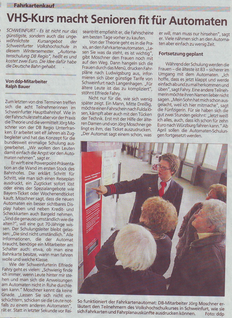 In fact the usability problems of German train ticket machines are still so pronounced that the
national rail company (DB) is now offering courses to teach people how to use them. (See the
scanned newspaper article, taken from Aalener
Nachrichten/Schwäbische Zeitung, Tuesday 18th December 2007. Sorry that it's more than a month old,
I've not had much time to blog recently.)
In fact the usability problems of German train ticket machines are still so pronounced that the
national rail company (DB) is now offering courses to teach people how to use them. (See the
scanned newspaper article, taken from Aalener
Nachrichten/Schwäbische Zeitung, Tuesday 18th December 2007. Sorry that it's more than a month old,
I've not had much time to blog recently.)
This article is somehow slightly scary and hilarious at the same time, in the way how the train staff systematically blame the users for their inability to use the system, rather than seeking the blame with the system itself. Hilarious because it’s so stereotypical, and scary because such a big organisation can get away with it without people putting up a fuss and explaining that this is just not acceptable.
Some highlights from the article:
Moschner [the course instructor] says that the new ticket machines have a more visible display and also accept cash besides credit and debit cards. "Are they just as cumbersome as the old ones?" an over-70-year-old lady enquires. The course instructor remains calm: "They are not cumbersome."
Hmm. Complete denial of the existence of problems. Two more quotes indicate that there is a fundamental misunderstanding of user behaviour going on:
"Read what it says there. It is important."
"The ticket machine really does tell you what it wants, you just have to look."
Why should I be trying to find out what the ticket machine wants? It should be trying to find out what *I *want! Also, I shouldn’t have to read every word on the screen. That’s simply not what people do. People don’t even read whether doors are labelled ‘PUSH’ or ‘PULL’ before trying one or the other. People just press random buttons in the hope of getting somewhere quickly, and the system should be designed to cope with this sort of behaviour. Anything else is just unrealistic and designed for robots rather than humans.
Fortunately this course is a positive initiative, probably with a thought along the lines of “well, if we can’t get the design right, at least we can teach people how to use the broken design”. I guess that’s a valid approach to the problem. And hey, 8 people turned up to that course, maybe that’s 8 fewer people who get frustrated with the machines. Sounds a bit like a drop in an ocean to me though.
If you found this post useful, please support me on Patreon so that I can write more like it!
To get notified when I write something new, follow me on Bluesky or Mastodon, or enter your email address:
I won't give your address to anyone else, won't send you any spam, and you can unsubscribe at any time.
My book, Designing Data-Intensive Applications, has received thousands of five-star reviews.
![]() Unless otherwise specified, all content on this site is licensed under a
Creative Commons
Attribution 3.0 Unported License.
Theme borrowed from
Carrington,
ported to Jekyll by Martin Kleppmann.
Unless otherwise specified, all content on this site is licensed under a
Creative Commons
Attribution 3.0 Unported License.
Theme borrowed from
Carrington,
ported to Jekyll by Martin Kleppmann.