My book
My book, Designing Data-Intensive Applications, has received thousands of five-star reviews.
Published by Martin Kleppmann on 24 May 2011.
This is a re-post from the Rapportive blog.
Today we are launching a new design for Rapportive. We put a huge amount of effort into this design, because we all believe deeply great user experience, and we know that our users really appreciate it too.
Here it is (best viewed fullscreen):
In this post I’d like to explain some of our process and thinking in the creation of the new design.
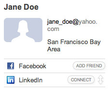
Our old design, which we had since launch, has served us very well. It was subtle, simple, effective, and blended in well with Gmail. Unfortunately, it was beginning to show some limitations:
These three points have a common theme: we do not handle long sidebars well.
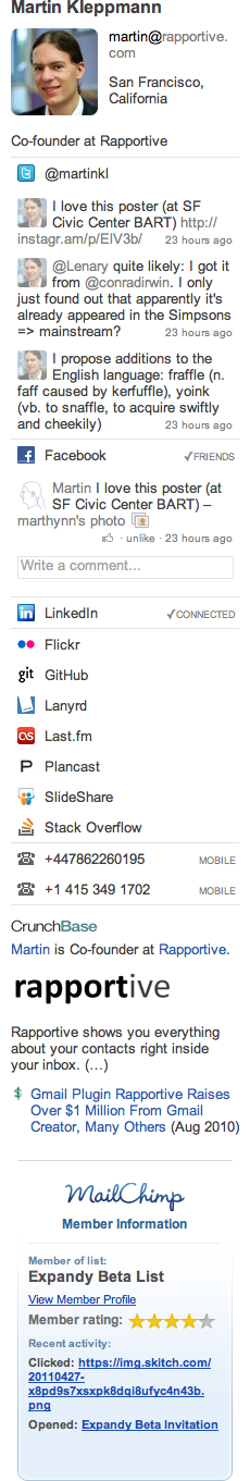
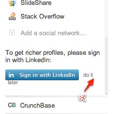
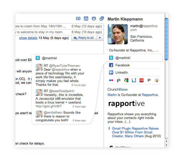
How long can a sidebar get? Well, here’s my sidebar, with the CrunchBase and the MailChimp Raplets:
As we add more features to Rapportive, these problems would only get worse, so we decided that it was time to rethink our design.
We had several guiding principles for the redesign. Rapportive should:
First of all, I started with some graphical tweaking. Here are some nice buttons:
Our first thought: we could simply give the Rapportive sidebar its own scrollbar. That would avoid having to scroll down to the bottom of a long conversation, because you could scroll the sidebar separately. But that approach is pretty bad. A large part of the sidebar may still end up being hidden off-screen, which means you have to go out of your way to scroll down, making it unlikely that you’ll discover things serendipitously.
Another idea that we ruled out quickly was a ‘tabbed’ interface. Tabs work well in a browser, where you have exactly one web page per tab, and each tab is independent. Rapportive isn’t like that: we might have several pages of information for one person (i.e. the tabs aren’t independent), and while we have several full tabs for one person, the information for another person might be a lot more sparse. That means that either you have to either have to waste a lot of space (e.g. always have a tab for tweets, even if the person doesn’t have a Twitter account), or you have things appearing in different places for different people (which is confusing). Finally, tabs require a lot of laborious clicking: you can’t see what’s in a tab without clicking it, and you can’t see the contents of two tabs at the same time. Tabs would have been an unpleasant, clunky interface.
An ‘accordion’ interface, like you find in Outlook for example, seemed like a step in a more promising direction:
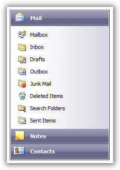
You can have several sections, and each section can expand to show additional information when you click it. When you expand one section, another one collapses to make room. (In the screenshot above, I could click ‘Contacts’ to see my list of contacts; the list of mailboxes under the ‘Mail’ heading would be hidden to make room for the list of contacts.)
Accordions are fairly efficient when space is very limited, but they suck if you have a large screen. If you have enough space that all your sections could be comfortably expanded side-by-side, why limit it to only one expanded section at a time? I don’t want to have to click a section to see what’s inside. It’s the same problem as with tabs.
So I started experimenting with a kind of adaptive accordion which could have several sections expanded at the same time, if there was enough screen space available. Here are some early design ideas:

The designs were fairly ugly, but I could see an algorithm emerging here. I figured that we needed an accordion with the following improvements:
Even scrollbars, despite being such a standard part of user interface design, have their problems:
Fortunately such spacing issues are easy to iron out. A harder question is: how do we communicate to the user that they can expand a section?
In the old design, if you clicked someone’s Twitter username, we would open up a new browser tab to show their tweet stream. In an accordion design, however, you’d expect that clicking the collapsed section will cause it to expand (i.e. show recent tweets, not open a new browser tab). Do we break the old interaction and force users to learn a new behaviour, or do we add an extra button for expanding a section?
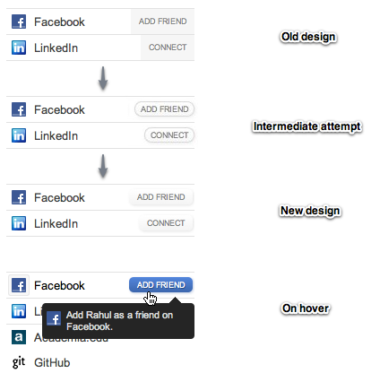
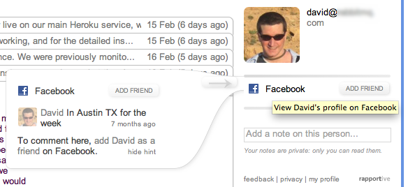
That was my first attempt. The arrows serve two purposes: to indicate that the section can be expanded, and to act as a button to trigger the actual expanding. But I didn’t like it. Some sections would have arrows and others wouldn’t (because we don’t always have additional information), so the “connect”/”add friend” buttons could become strangely misaligned. It also made the interface look more cluttered and complicated.
Surely we could do better? For example, could we show the button for expanding a section only when you hover over it? That’s an interesting idea. What’s more, we could then calculate how tall the section would be if it was expanded, and indicate it with the height of the arrow:
At this point we’re really moving away from established user interface patterns. Will users notice the arrow, and understand what it means? Will they figure out that you can click it? It contains a lot of information: the fact that the section can be expanded, how big it will be and where it will be placed when expanded. It’s also a much bigger click target than the previous arrow button, which is good. But it still has the problem of not looking particularly like a button. (It goes grey when you hover over it, to indicate that you can interact with it, but still it’s not exactly obvious.)
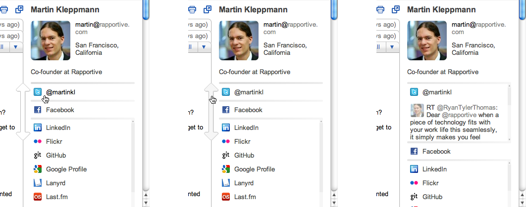
I was starting to get sick of this redesign, but fortunately, inspiration struck again. If we’re already using an arrow on hover to indicate how tall the expanded section will be, well… why don’t we use the expanded section itself to indicate how tall it will be? Yes, we can just show the expanded section itself on hover!
It’s obvious in retrospect, but it took a surprisingly long time to come up with this design. I call it the “genie” because it looks like a ghost that has come out of an oil lamp. Although the version above still isn’t pretty, it really got to the bottom of many of the challenges I discussed at the beginning:
Not all is great though. If there is space, we’d still like to show you the expanded section in the sidebar right away, without you having to hover the mouse. But how do we make clear to users that sections can be expanded?
In the screenshot above, I tried using a button with an arrow pointing right. If you clicked it, the expanded section would slide into the sidebar, and the other sections would move out of the way to make room. I liked the animation, but the button was ugly. Fortunately, Rahul had the idea that we could use a right-pointing mouse cursor to indicate the same thing. So now you can click anywhere on the genie and it will slide into the sidebar.
After some graphical tweaking, this is what the final design looks like:
I hope you’ll agree that it is gorgeous. We have added very little new user interface (and we’ve taken a lot away, compared to earlier designs), but the result is very effective. It fits neatly on both big and small screens, it is easy to use, and it is actually lots of fun to play with. Give it a try for yourself, and let us know what you think!
Usability without design is dreary. Design without usability is pretentious. Design and usability together are delightful.
If you found this post useful, please support me on Patreon so that I can write more like it!
To get notified when I write something new, follow me on Bluesky or Mastodon, or enter your email address:
I won't give your address to anyone else, won't send you any spam, and you can unsubscribe at any time.
My book, Designing Data-Intensive Applications, has received thousands of five-star reviews.
 Unless otherwise specified, all content on this site is licensed under a
Creative Commons
Attribution 3.0 Unported License.
Theme borrowed from
Carrington,
ported to Jekyll by Martin Kleppmann.
Unless otherwise specified, all content on this site is licensed under a
Creative Commons
Attribution 3.0 Unported License.
Theme borrowed from
Carrington,
ported to Jekyll by Martin Kleppmann.