LinkedIn Intro: Doing the Impossible on iOS
Published by Martin Kleppmann on 23 Oct 2013.
This is a copy of a post I originally wrote on the
LinkedIn engineering blog.
We recently launched LinkedIn Intro — a new product that shows you
LinkedIn profiles, right inside the native iPhone mail client. That’s right: we have extended
Apple’s built-in iOS Mail app, a feat that many people consider to be impossible. This post is
a short summary of how Intro works, and some of the ways we bent technology to our will.
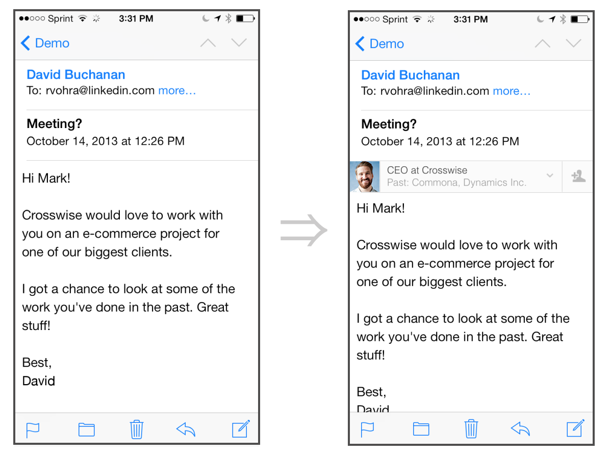
With Intro, you can see at a glance the picture of the person who’s emailing you, learn more about
their background, and connect with them on LinkedIn. This is what it looks like:

The iPhone mail app, before and after Intro
How Intro Came to Be
The origins of Intro go back to before the acquisition of Rapportive by
LinkedIn. At Rapportive, we had built a browser extension that modified Gmail to show the profile of
an email’s sender within the Gmail page. The product was popular, but people kept asking: “I love
Rapportive in Gmail, when can I have it on mobile too?”
The magic of Rapportive is that you don’t have to remember to use it. Once you have it installed, it
is right there inside your email, showing you everything you need to know about your contacts. You
don’t need to fire up a new app or do a search in another browser tab, because the information is
right there when you need it. It just feels natural.
At LinkedIn, we want to work wherever our members work.
And we know that professionals spend a lot of time on their phone, checking and replying to emails
— so we had to figure out how to enhance mobile email, giving professionals the information they
need to be brilliant with people.
But how do we do that? Ask any iOS engineer: there is no API for extending the built-in mail app on
the iPhone. If you wanted to build something like Rapportive, most people would tell you that it is
impossible. Yet we figured it out.
Impossible #1: Extending the iOS Mail Client
Our key insight was this: we cannot extend the mail client, but we can add information to the
messages themselves. One way to do this would be to modify the messages on the server — but then the
modification would appear on all your clients, both desktop and mobile. That would not be what users
want.
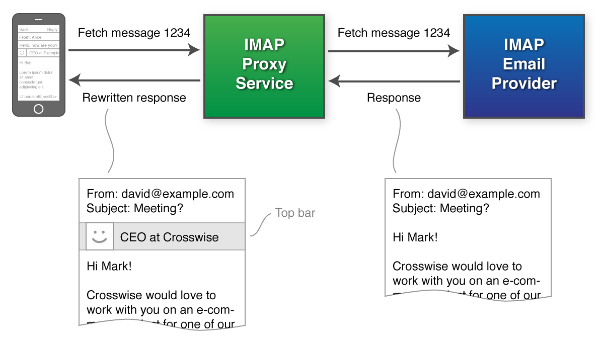
Instead, we can add information to messages by using a proxy server.

Rewriting messages using an IMAP proxy
Normally your device connects directly to the servers of your email provider (Gmail, Yahoo, AOL,
etc.), but we can configure the device to connect to the Intro proxy server instead.
The Intro proxy server speaks the IMAP protocol just like an
email provider, but it doesn’t store messages itself. Instead, it forwards requests from the device
to your email provider, and forwards responses from the email provider back to the device. En route,
it inserts Intro information at the beginning of each message body — we call this the top bar.
The great thing about this approach: the proxy server can tailor the top bar to the device, since it
knows which device is downloading the message. It can adapt the layout to be appropriate to the
screen size, and it can take advantage of the client’s latest features, because it doesn’t need to
worry about compatibility with other devices.
Our proxy server is written in Ruby using EventMachine, which allows it to efficiently handle many
concurrent IMAP connections. We have developed some libraries to make the evented programming model
nicer to work with, including
Deferrable Gratification and
LSpace.
Impossible #2: Interactive UI in Email
Ok, we have a way of adding information about the sender to a message — but so far it’s just
a static piece of HTML. The top bar is deliberately minimal, because we don’t want it to get in the
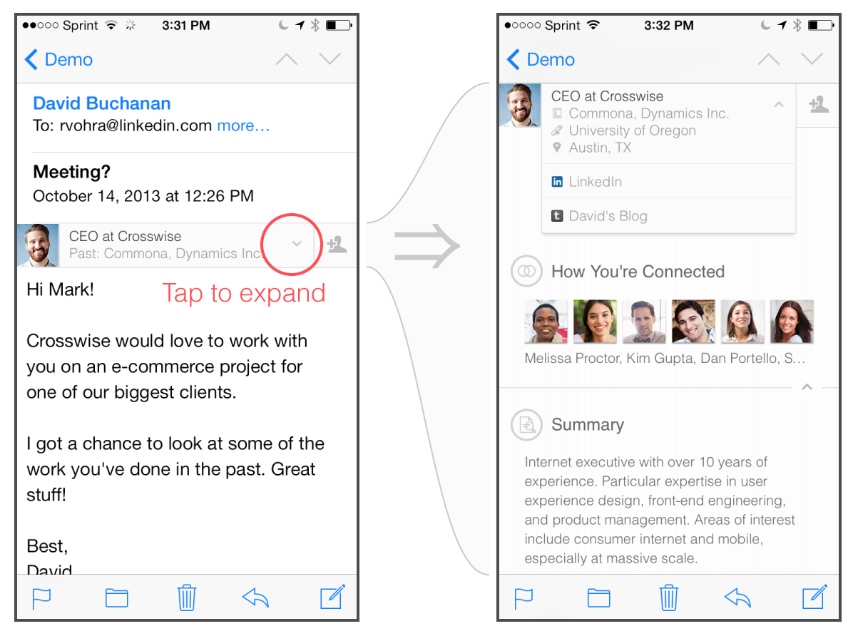
way. But wouldn’t it be awesome if you could tap the top bar and see the full LinkedIn profile…
without leaving the mail app?
“But that’s impossible,” they cry, “you can’t run JavaScript in the mail client!” And that’s true
— any JavaScript in an email is simply ignored. But iOS Mail does have powerful CSS capabilities,
since it uses the same rendering engine as Safari.
Recall that CSS has a :hover state that is triggered when you hover the mouse over an element.
This is used for popup menus in the navigation of many websites, or for tooltips. But what do you do
on a touchscreen device, where there is no hovering or clicking, only tapping?
A little-known fact about CSS on Mobile Safari: in certain circumstances, tapping a link once
simulates a :hover state on that link, and tapping it twice has the effect of a click. Thanks to
this feature, popup menus and tooltips still work on iOS.
With some creativity, we figured out how to use this effect to create an interactive user interface
within a message! Just tap the top bar to see the full LinkedIn profile:

With CSS tricks we can embed an entire LinkedIn profile in a message
Impossible #3: Dynamic Content in Email
This :hover trick allows us to have some interactivity within a message, but for more complex
interactions we have to take you to the browser (where we can run a normal web app, without the mail
app’s limitations). For example, if you want to connect with your contact on LinkedIn, we take you
to Safari.
That’s fine, but it leaves us with a problem: the top bar needs to show if you’re already connected
with someone. Say you send an invitation, and the other person accepts — now you’re connected, but
if you open the same email again, it still says that you’re not connected!
This is because once a message has been downloaded, an IMAP client may assume that the message will
never change. It is cached on the device, and unlike a web page, it never gets refreshed. Now that
you’re connected, the top bar content needs to change. How do we update it?
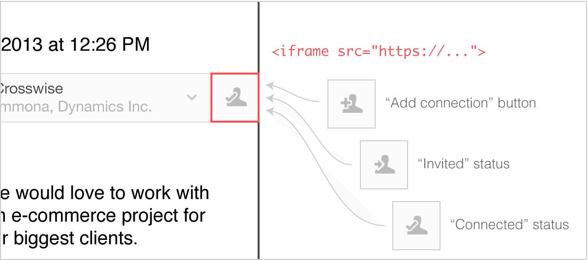
Our solution: the connect button is in a tiny <iframe> which is refreshed every time you
open the message. And if you open the message while your device is offline? No problem: the iframe
is positioned on top of an identical-looking button in the static top bar HTML. If the iframe
fails to load, it simply falls back to the connection status at the time when the message was
downloaded.
This allows the top bar to contain dynamic content, even though it’s impossible for the server to modify a message once it has been downloaded by the device.

Using an embedded iframe to keep the connection status up-to-date, within an otherwise static top bar
Impossible #4: Easy Installation
Once we got the IMAP proxy working, we were faced with another problem: how do we configure a device
to use the proxy? We cannot expect users to manually enter IMAP and SMTP hostnames, choose the
correct TLS settings, etc — it’s too tedious and error-prone.
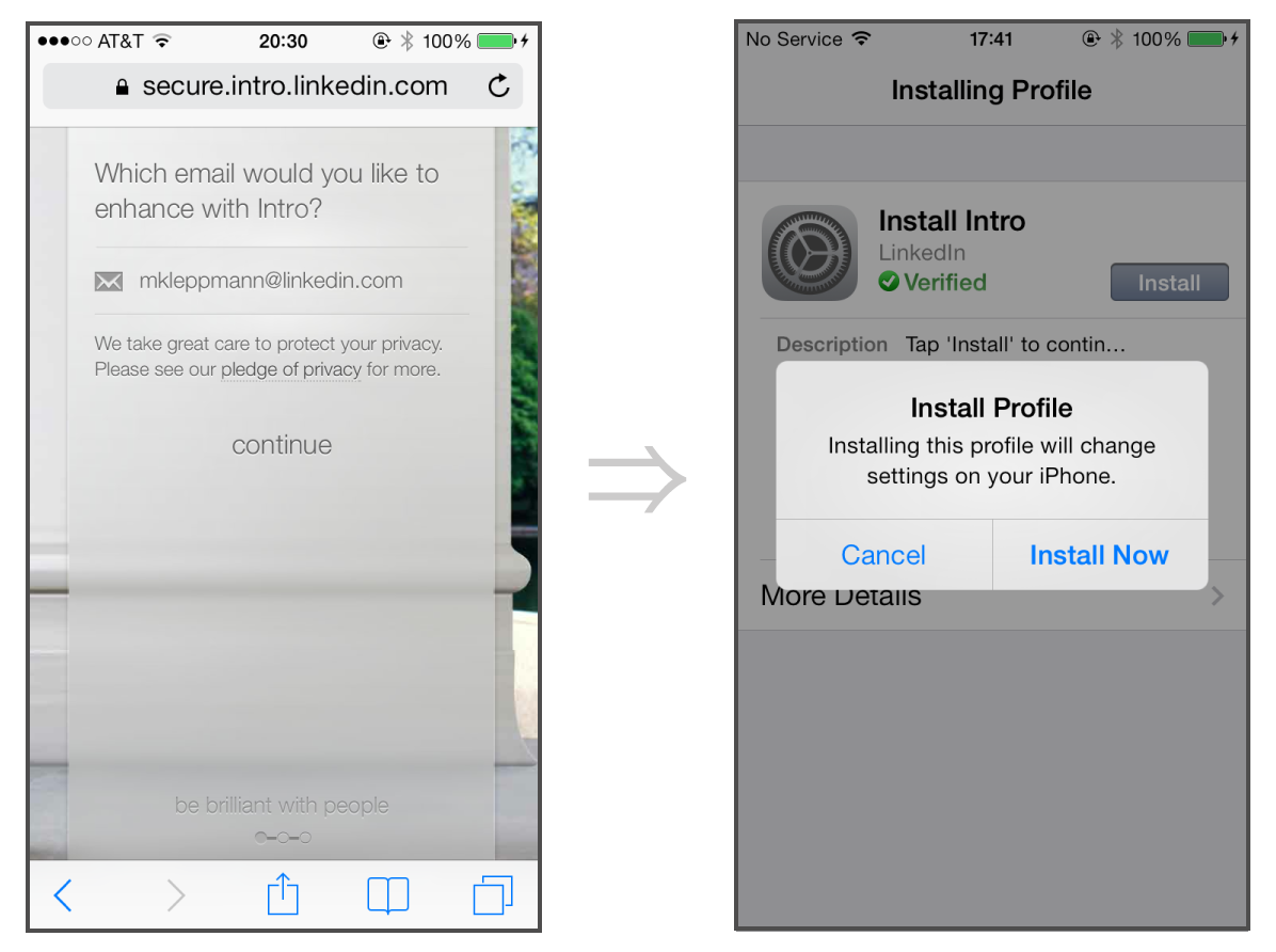
Fortunately, Apple provides a friendly way of setting up email accounts by using
configuration profiles
— a facility that is often used in enterprise deployments of iOS devices. Using this technique, we
can simply ask the user for their email address and password, autodiscover the email provider
settings, and send a configuration profile to the device. The user just needs to tap “ok” a few
times, and then they have a new mail account.
Moreover, for Gmail and Google Apps accounts, we can use OAuth, and never need to ask for the user’s password. Even better!

iOS configuration profiles make setup of new email accounts a breeze
Security and Privacy
We understand that operating an email proxy server carries great responsibility. We respect the fact
that your email may contain very personal or sensitive information, and we will do everything we can
to make sure that it is safe. Our principles and key security measures are detailed in our
pledge of privacy.
Conclusion
When we first built Rapportive for Gmail, people thought that we were crazy — writing a browser
extension that modified the Gmail page on the fly, effectively writing an application inside someone
else’s application! But it turned out to be a great success, and many others have since followed our
footsteps and written browser extensions for Gmail.
Similarly, Intro’s approach of proxying IMAP is a novel way of delivering software to users. It
operates at the limit of what is technically possible, but it has a big advantage: we can enhance
the apps you already use. Of course the idea isn’t limited to the iPhone, so watch out for new
platforms coming your way soon :)
This post has only scratched the surface of the interesting challenges we have overcome while
building Intro. In follow-up posts we will talk about some of our CSS techniques, testing and
monitoring tools, things we do to achieve high performance and high reliability, and more. In the
meantime, check out Intro and let us know what you think!
If you found this post useful, please
support me on Patreon
so that I can write more like it!
To get notified when I write something new,
follow me on Bluesky or
Mastodon,
or enter your email address:
I won't give your address to anyone else, won't send you any spam, and you can unsubscribe at any time.
