My book

My book, Designing Data-Intensive Applications, has received thousands of five-star reviews.
Published by Martin Kleppmann on 15 Mar 2017.
How we created an illustrated guide to help you find your way through the data landscape.
Designing Data-Intensive Applications, the book I’ve been working on for four years, is finally finished, and should be available in your favorite bookstore in the next week or two. An incomplete beta (Early Release) edition has been available for the last 2½ years as I continued working on the final chapters.
Throughout that process, we have been quietly working on a surprise. Something that has not been part of any of the Early Releases of the book. In fact, something that I have never seen in any tech book. And today we are excited to share it with you.
In Designing Data-Intensive Applications, each of the 12 chapters is accompanied by a map. The map is a kind of graphical table of contents of the chapter, showing how some of the main ideas in the chapter relate to each other.
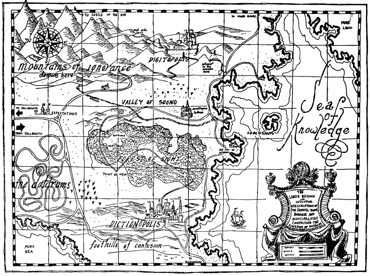
Here is an example, from Chapter 3 (on storage engines):
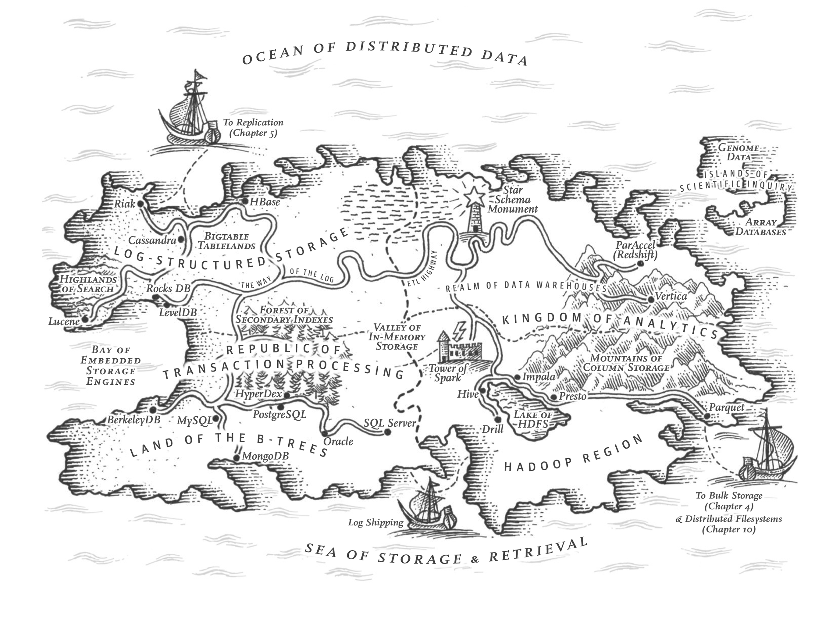
Figure 1. Map illustration from Designing Data-Intensive Applications, O’Reilly Media, 2017.
Don’t take it too seriously—some of it is a little tongue-in-cheek, we have taken some artistic license, and the things included on the map are not exhaustive.
But it does reflect the structure of the chapter: political or geographic regions represent ways of doing something, and cities represent particular implementations of those approaches. Similar things are more likely to be close together, and roads or rivers represent concepts that connect different implementations or regions.
Most computing books describe one particular piece of software and discuss all the aspects of how it works. This book is structured differently: it starts with the concepts—discussing the high-level approaches of how you might solve some problem, and comparing the pros and cons of each—and then points out which pieces of software use which approach. The maps use the same structure: the region in which a city is located tells you what approach it uses.
For example, in the map above, you can see a high-level subdivision into two countries: transaction processing and analytics. Within transaction processing, there are two regions: log-structured storage and B-trees, which are two ways of implementing OLTP storage engines. Within the B-tree region, you see databases like MySQL and PostgreSQL[1], while within the log-structured region you see databases like Cassandra and HBase. On the analytics side, you can see that the mountain range representing column storage reaches into both the data warehousing and the Hadoop regions, since the approach applies to both.
The maps are in black and white, both because of practicalities of printing and also because I was looking for a Tolkien-esque style. You are, of course, welcome to color them in yourself. In fact, by coloring them in, you would be following a fine tradition: for over three centuries, maps were printed in black and white from an engraved copper plate, and then colored in by hand.
Each of the chapters has a map like that, focusing on the particular aspects discussed in that chapter. This means that some cities appear on multiple islands—the data landscape is multidimensional, so a city may lie in more than one (conceptual) realm. For example, the map below is for Chapter 5 (on the topic of replication):

Figure 2. Map illustration from Designing Data-Intensive Applications, O’Reilly Media, 2017.
Cities representing Cassandra, MongoDB, MySQL, and others appear on both this map, the Chapter 3 map above, and some other maps, too.
Shipping routes connect some of the ports shown in the maps, in cases where there is a noteworthy link between chapters. Most of the maps are of islands, but there are some exceptions. (I won’t give away too much, but I just want to say…beware of the Kraken.)
I am incredibly delighted that O’Reilly was willing to take on this crazy idea of creating maps. It took a whole team to make them happen: from my rough pencil sketches (which showed the structure but had absolutely zero artistic value), Shabbir Diwan, Edie Freedman, and Ron Bilodeau created the beautifully illustrated versions you see above, and Marie Beaugureau patiently managed several rounds of revisions, in which we painstakingly polished all the details.
Perhaps you’re curious to know how we got onto the idea of creating maps. Early on in the Early Release of the book, some readers told me they would love some kind of flowchart to help them decide quickly which database they should use for their application. Such flowcharts have been attempted, but I never liked them much—it is tempting to read them out of context and jump to conclusions too quickly, and they have to simplify the issues to the point of almost being intellectually dishonest.
My goal for Designing Data-Intensive Applications was different. I can’t in good faith give you a recommendation for one particular tool because I don’t know enough about your particular requirements. However, I can teach you what questions to ask and how to evaluate vendors’ claims critically. That requires more subtlety and detail than can be expressed in a one-page flowchart, which is why the book is 600 pages long, not one page.
However, I did think that some kind of graphical representation of the main ideas and structure would be useful. I thought about Venn diagrams, but they’re excruciatingly boring. I thought about mind maps, and then started taking the “maps” bit more literally. I thought about the Atlas of Experience by Louise van Swaaij and Jean Klare, a sublime book that represents aspects of human life as fictitious places on a geographic map. (It is originally in Dutch; the English translation is, sadly, out of print.) The Phantom Tollbooth by Norton Juster and Jules Feiffer does a similar thing.
Closer to technology, similar map-style visualizations have been used to represent online communities, to visualize the history of relational databases and programming languages, and to explain libraries related to Facebook’s React. I simply love the style.
Other inspirations for me are the ornate maps produced in the medieval and renaissance periods, especially when it comes to whimsical sea monsters. For example, around 1590, Abraham Ortelius published a wonderful map of Iceland, with Mount Hekla spewing fire, and surrounded by fantastical sea monsters:
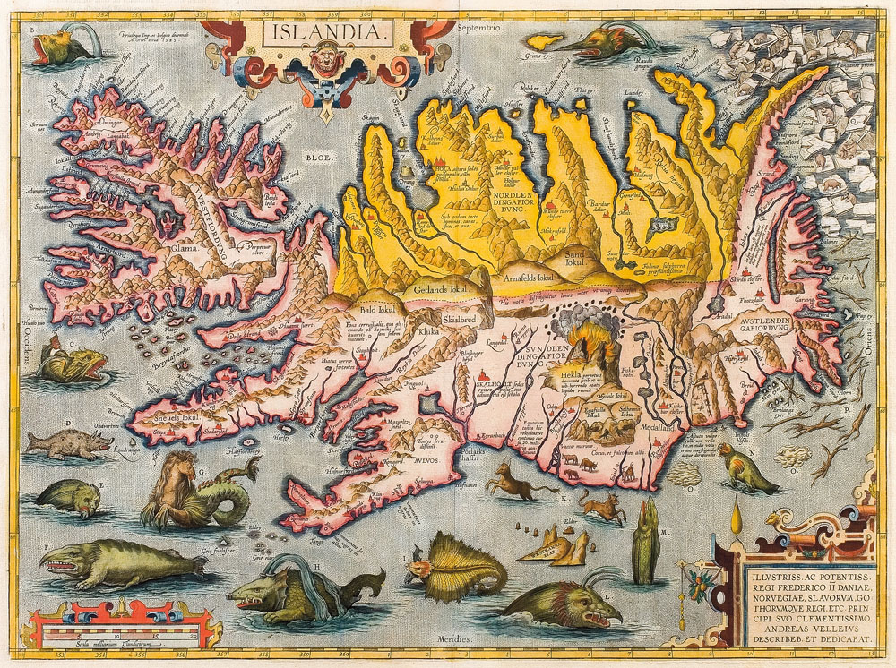
Figure 3. “Islandia” map by Abraham Ortelius, ca. 1590. Source:
Wikimedia Commons
I feel those maps and sea monsters reflect the 16th-century sense of excitement to explore the earth and discover new places, as well as the dangers of sailing across unknown seas. And perhaps a bit of that excitement exists today in our exploration of technologies for storing, processing, and using data. There seems to be a lot of potential, but we also don’t really know what we’re doing, and it’s sometimes a bit dangerous (raise your hand if you’ve lost data at some point because something went wrong).
We hope the maps in Designing Data-Intensive Applications will help convey some of that excitement, and also make you smile. In both the print and ebook editions, the map for each chapter appears at the start of each chapter.
What’s more, we have taken all the individual chapter maps and assembled them into a poster—an archipelago of islands representing technologies in the sea of distributed data. The poster also includes some bonus sea monsters (of course).
If you are at Strata + Hadoop World, San Jose this week, you can drop by the O’Reilly booth to pick up a free print of the poster so you have something geeky and cool to hang on the wall in your office. Alternatively, you can download a JPG version for free from the O’Reilly website for your personal, noncommercial use.
We hope you enjoy Designing Data-Intensive Applications and the maps as much as we enjoyed making them!
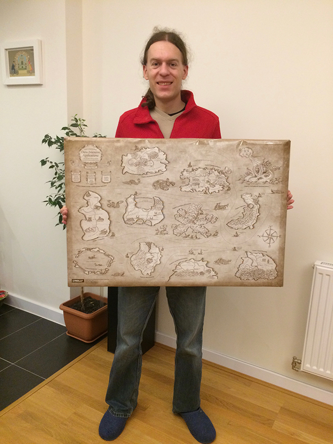
Figure 4. Me holding the poster with the maps.
[1] Footnote for the well-actually crowd: yes, I know about hash indexes and GiST in PostgreSQL, various other index types in other databases, and the fact that in MySQL the index type is actually a matter of the storage engine (such as InnoDB), but those details are beside the point here. I am highlighting a dichotomy between a page-oriented update-in-place approach and a log-structured, compaction-based approach. This distinction is best explained with concrete examples, and the graphical representation cannot capture all the subtleties that are discussed in the text of the book.
If you found this post useful, please support me on Patreon so that I can write more like it!
To get notified when I write something new, follow me on Bluesky or Mastodon, or enter your email address:
I won't give your address to anyone else, won't send you any spam, and you can unsubscribe at any time.
My book, Designing Data-Intensive Applications, has received thousands of five-star reviews.
![]() Unless otherwise specified, all content on this site is licensed under a
Creative Commons
Attribution 3.0 Unported License.
Theme borrowed from
Carrington,
ported to Jekyll by Martin Kleppmann.
Unless otherwise specified, all content on this site is licensed under a
Creative Commons
Attribution 3.0 Unported License.
Theme borrowed from
Carrington,
ported to Jekyll by Martin Kleppmann.