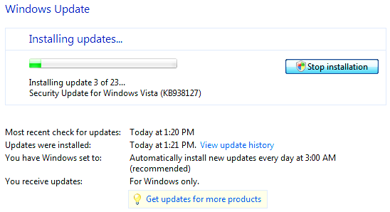
Screenshots from Windows Vista Update
Published by Martin Kleppmann on 24 Nov 2007.
Jimmy sent me some screenshots of Windows Vista which exemplify
my complaints about unclear labelling of
buttons – a usability problem which
occurs so frequently that I’ve named this whole blog after it. He was running Windows Update, which
was installing a bunch of software
updates:

It turned out that he didn’t actually want to install those updates now,
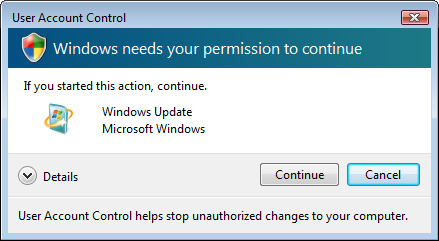
so he hit the “Stop installation” button. Up pops a dialog box:

Now what does this mean? Does continue mean “continue stopping the
installation”, or does it mean “continue the installation”? If we press cancel, will this
cancel the request to stop installing updates, or will it cancel the installation process itself?
And what does the red X button in the corner do? (The temptation to press X in cases like this is
huge: I consider it to mean “shut up, go away, I don’t want to think about what you are asking
me”.)
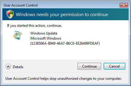
But there is still hope: a “Details” button, which will surely reveal
the answer and tell us what button to press. So we click
“Details”:

Oh, that was really useful. You know, we love hexadecimal numbers. Thank you, Microsoft!
But Microsoft are not the only offenders
in this regard.
Barbara Ballard is having
similar problems with OpenOffice.
If you found this post useful, please
support me on Patreon
so that I can write more like it!
To get notified when I write something new,
follow me on Bluesky or
Mastodon,
or enter your email address:
I won't give your address to anyone else, won't send you any spam, and you can unsubscribe at any time.
